ABOUT
Drawing, in its various guises forms the basis of William Rounce’s practice.
His work includes work created in a variety of media; perspective drawing, collage, installation and animation.
To read details about the various projects, please scroll down -
PUBLIC ARTWORK
INSTALLATION/
INTERVENTION
ANIMATION
PERSPECTIVE DRAWING
PAINTING
PHOTOGRAPHY
Public artwork
William Rounce’s permanent site specific artwork was created as part of the redevelopment of 8-10 Colston Avenue, Bristol, into student accommodation. The project was commissioned by Ginkgo projects for Urban Creation Ltd.
Split over four floors the permanent artwork is comprised of 42 separate stove-enamelled aluminium panels fixed to the five sides of the outer balcony walls. Bristol’s maritime history was used as a starting point for the concept of the project. The design’s linear vertical and horizontal forms loosely reference the schematic shape of ships’ masts.
Occupying the space between drawing and architecture, his work is concerned with issues of formalism such as shape, colour, line, surface and form. With a rigorous formal approach to drawing, the piece works within a set of parameters, which are closely aligned and calibrated within the dimensions and proportions of the space. Using an economy of means this artwork alters ones perception of space, perspective and illusion. It functions as a single artwork that can be seen from multiple viewpoints; its constituent design elements converging to create imaginary planes that connect the balconies together. With its shifting perspectives the artwork reveals itself gradually, allowing residents to experience the space in a new and unfamiliar way.
The balconies are a key feature of site’s architecture and have a dual purpose. Firstly, as a transient space, but also as an area for students and residents to reflect and socialise. The artwork seeks to create a sense of community and cohesion as the viewer becomes an active participant of the work.
‘The negotiation between the artwork and its setting is a relationship whereby the artwork both activates and is activated by the surrounding space’
Jack Brindley, There are Two Types of Clarity, Apiary Studios (2011).
Through reflection and the push and pull of colour, there is a constant play between both the illusionistic and physical space. Spatial relationships are created between the positive and negative space of the design. Using a warm colour palette, bands of diagonal and horizontal colour ascend and descend across the full height of the balconies. Horizontal strips of colour transverse and wrap around the internal atrium, connecting and redefining the shape and proportions of the space.
Installation/Intervention
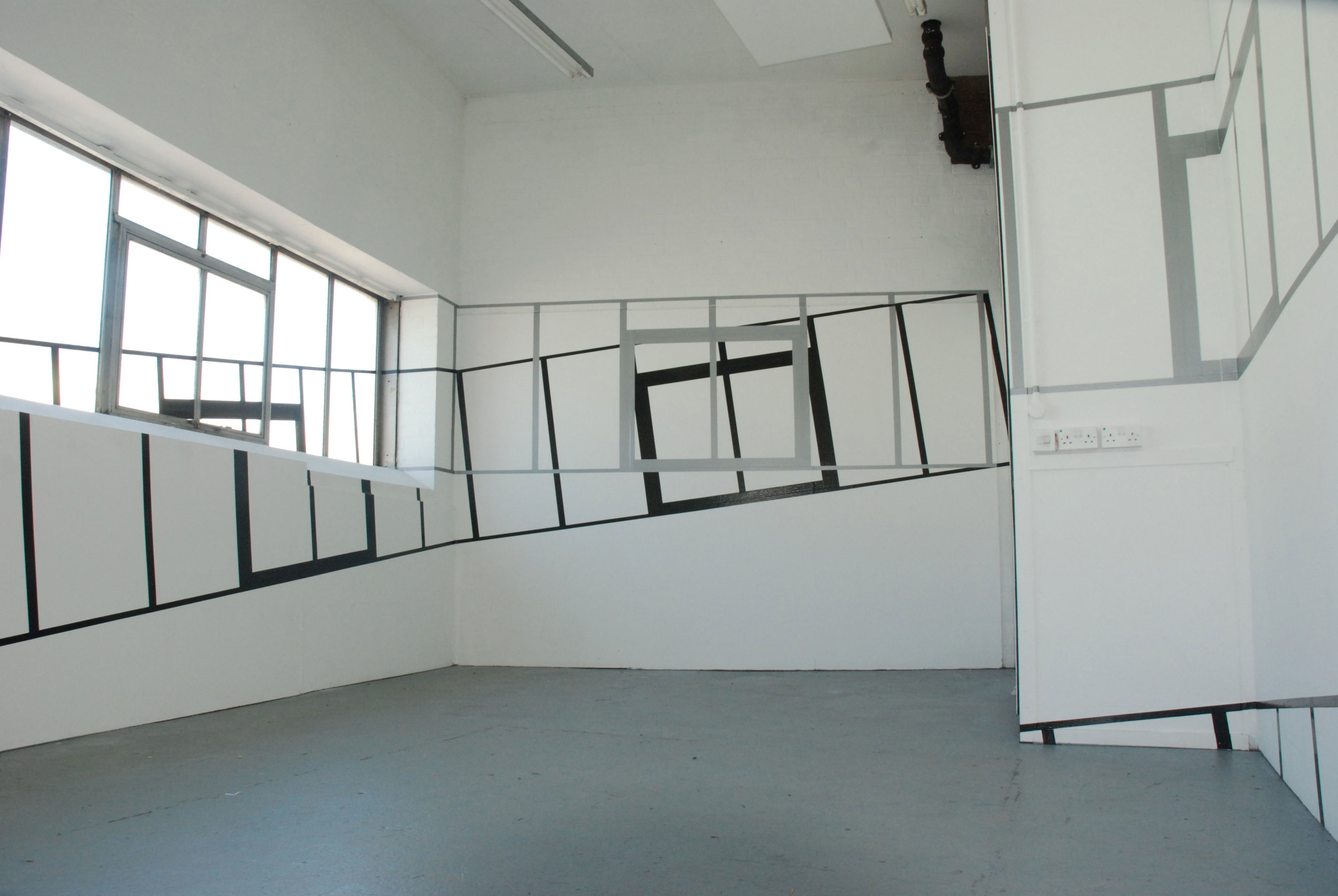
His temporary ‘interventions’ relate to the dimensions and proportions of the space they are created within; there is always a close interdependence with the architectural features of the site.
Using inexpensive adhesive tape applied directly and precisely to the surfaces of a space, lines are used to de-mark, dissect, transverse, connect and repeat the site’s physical boundaries and architectural features.
As you move around the space different viewpoints are created and the drawings alter and reveal themselves over time - their constituent parts meeting to create imaginary planes. The completed installations play with ones perception of space, perspective and illusion.
The line is Sandback’s primary sculptural form:
"The line is a whole, an identity, for a particular place and time. His lines may be freestanding verticals, connecting the top and bottom of a space, controlling its limits with the majestic calm of their upward thrust. They may be angled, descending or ascending, moving dynamically through the space, their relationship to both space and viewer altering as the viewer moves around them.
Artinfo, Fred Sandback at Edinburgh's Fruitmarket Gallery, 26 Nov 2007
www.artinfo.com/news/story/13357/fred-sandback-at-edinburghs-fruitmarket-gallery/
Animation
Through meticulously building up repeated geometric forms with traces of measured mark making, there is a sense of incremental growth without resolution.
Through this process, the drawing’s construction begins to take precedent over the 'representational’ elements of the work. Lines are used as markers of space, control, measurement and ultimately erasure. The stop-frame animation is an attempt to physically record these decisions that make up the construction of a drawing.
Drawings
His influences include Minimalism and architectural diagrams and his work investigates the mechanisms involved in the physical construction of a drawing. He takes a systematic and rigorous formal approach to drawing; working within set procedures, governed by the laws of perspective. Meticulously building up repeated geometric forms with traces of measured mark making, there is a sense of incremental growth without resolution. Through this process, the drawing’s construction begins to take precedent over the ‘representational’ elements of the work. There has been no attempt to hide the many working marks and measurements. Lines are used as markers of space, control, measurement and ultimately erasure.
The title ‘One thing after another’ references a quote by Minimalist artist Donald Judd, and the practice of using repeated identical units within his work. Each repeated individual unit acts a ‘building block’ to methodically and systematically construct the drawing within the parameters of the grid.
“The building blocks of that universe are the cube, the plane and the line”
Jerry Saltz- Non Specific Objects – Modern Painters, March 2007
Painting
These paintings are concerned with the relationship between colour, form, pictorial structure and space. Architectural references are frequently used alongside perspectival schemes to highlight spatial illusion. As paintings are continually reworked and adjusted, the process itself takes precedent. The painting is worked back revealing different layers which contrasts with areas of thick impasto. Through this process he aims to create a dynamic tension between the pictorial and the painterly.


